Attract More Conference Attendees to Your Trade Show Booth
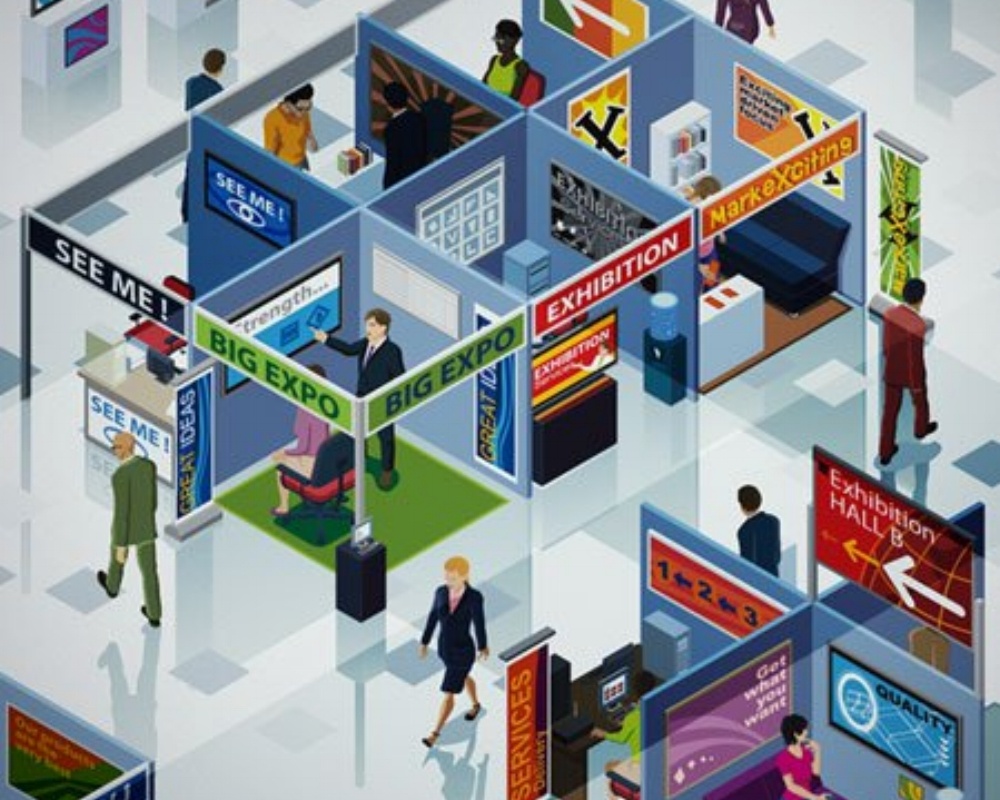
Just attending a show isn’t enough. It’s crowded, packed with booths, and everything and everyone is doing what they can to get noticed. Here are a few tips I’ve picked up over my 10+ years of designing booths, working alongside clients and booth companies, and being a show attendee myself that I have seen impact overall trade show experience and success.
Smart design.
Don’t forget about making your booth comfortable – your staff will appreciate it and so will the attendees.
Trade shows are exhausting so put yourself in the attendees’ shoes. Literally. Shows are framed in cement pathways which can take a toll on attendees. So when deciding what to “splurge on” in your budget - extra carpet padding is worth the extra price. You would be surprised the increased foot traffic and the staying power your booth will have. Leading to more opportunities to engage in conversation.
Another part of making your booth more inviting that the next is how it’s lit. Can they see your sign? Can they read your materials? Is your product well lit?
Don’t place signage or type on your booth below table height - it will often be overlooked or ignored. Even worse avoid placing your logo at the base of your booth. It’s wasted real estate since more often than not it will be blocked by something or someone. Instead place it up high or even better, hang a sign.
I understand not everyone has a huge budget to do an elaborate display, I get that, but don’t be afraid to work with what you have. Watch the clutter and move tables so they don’t create a wall between you and the attendees. Angles aren’t a bad thing if they funnel to you and your product.
Think about the attendees’ Booth experience.
Less is more. When considering copy for a booth design, think billboard versus a long format brochure. Keep it brief. Long drawn out paragraphs on an outdoor board don’t make sense, so why would it be here? Remember, you are only one booth of several and attendees aren’t interested in a long read – they just have too many booths to visit. There are times and places for paragraphs and those places are within brochures or your website not your booth. Instead your booth should be an selling environment and an opportunity for your staff to educate and persuade.
A strong concept delivered with compelling graphics, minimal type and a well placed logo can say more than paragraphs of copy.
Consistency! One look, one voice. Make sure you are sending the same message across all points of contact. Your booth and literature should have a consistent look and feel as your website. Also, consider what your staff will be wearing and be sure it’s appropriate for your brand. Think of the being an extension of the booth whether they’re working it or out on the main floor.
The booth is only part of your tradeshow success. You should alway include pre-show and post-show tactics to make sure you are getting the most out of showing up – Pre-show emails, giveaways, demonstrations, and a follow up plan can be effective, but they are only a small part of what could make your show go from just showing up to leaving with quality leads or better yet a new client. So keep these in mind going forward:
- Have your staff engaged. Be present. Always have someone manning the booth who’s ready to champion your product. Don’t leave it unmanned – you never know who you might miss.
- Watch your body language. Those working the booth are often the first impression of your company and how they are viewed matters. Crossed arms don’t send the signal “Come talk to me” nor does a group of your staff sitting in a corner talking amongst themselves.
- You want to be approachable. You have to work the booth to get the conversion your seeking.


