How to Create the Best Billboard Ads
In print advertising, headlines are critical. They’re the bait. They grab your attention, and once you’re hooked, the body copy begins reeling you in with product or brand benefits, Unique Selling Propositions (USPs), reasons to change your behavior and so on. After this, either the fishing line breaks and you’re off the hook, or the CTA brings you aboard the boat and throws you into an ice-filled Styrofoam cooler marked “sold.”
But that’s print advertising. The process for outdoor advertising? It’s a little different. You have a huge, 672 square-foot canvas to plaster your message onto. That’s a lot of space. That’s like 100 full-page print ads. You can fit a lot of messaging on there.
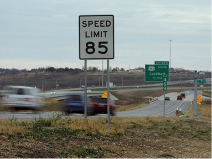
But your audience is reading it at 70 mph.
Or even faster in southern Texas.
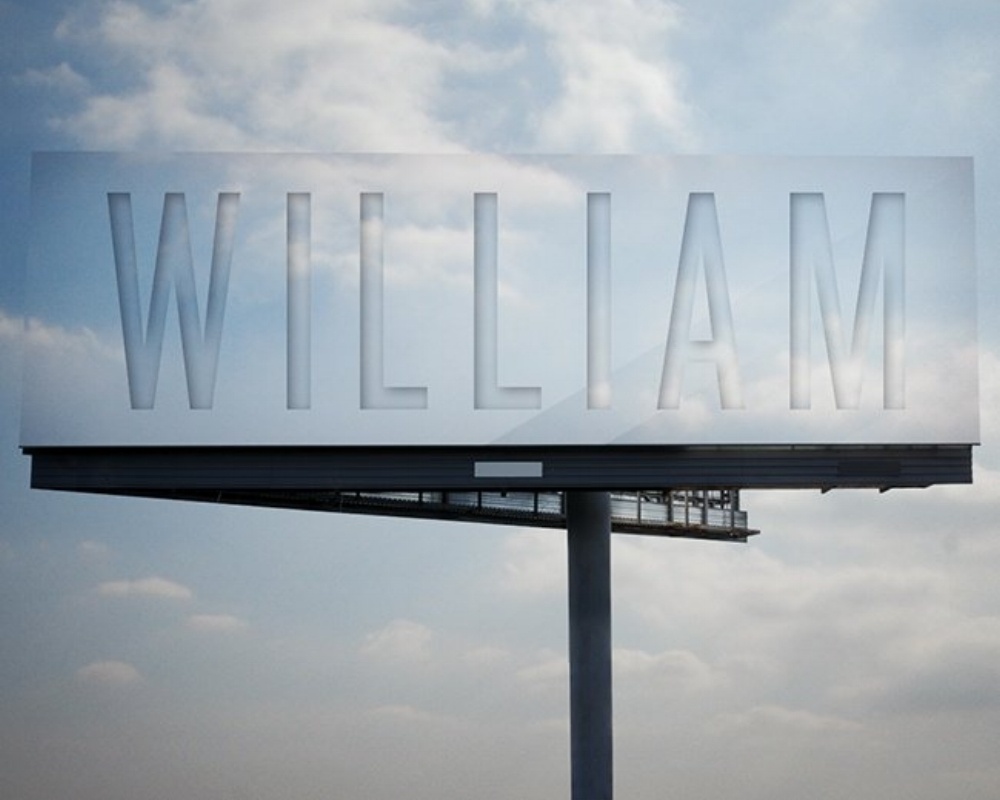
So your time is limited. On a billboard, the headline, body copywriting and CTA are all rolled up into one short, concise little ditty. And if they’re not, they should be. It’s a Billboard. Not a Williamboard.
If print advertising is like fishing, outdoor advertising is like spearfishing. You’ve got one shot to hit the audience with your message. If you want to be effective, you have to be sharp. You have to be powerful. And you have to be quick.
With that in mind, here are some general guidelines to follow when creating strategic, creative, successful outdoor advertisements… for an audience speeding by.
- Keep it short and sweet
You only have a few seconds (six is the average) to get your point across. Clutter your space with too many words and your ad will most likely be ignored.
Like this: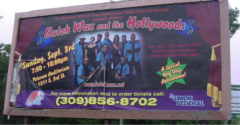
Hopefully the concert was more packed than the billboard.
A billboard takes everything you want to say about your product or brand and boils it all down to a very small team of words. Billboard messages are like jockeys: the shorter, the better.
In many cases, a large, easy-to-read headline is ideal. If necessary, a short subhead underneath. A three- to five-word headline is a base hit. A one-word headline is a homerun.
Dr. Pepper hit one here:
The ad says a lot with a little. Dr. Pepper Ten is chiefly marketed as a beverage that is “not for women.”
Testosterone = Male hormone. Taste = A selling point for Dr. Pepper Ten. Taste + Testosterone = You get the idea. Dr. Pepper Ten is not for women.
The subhead backs up the manly theme and offers another benefit of the soda (low in calories). All of this from four words.
It’s a well-executed billboard. Just what the Dr. ordered. - Grab attention, but don’t be distracting
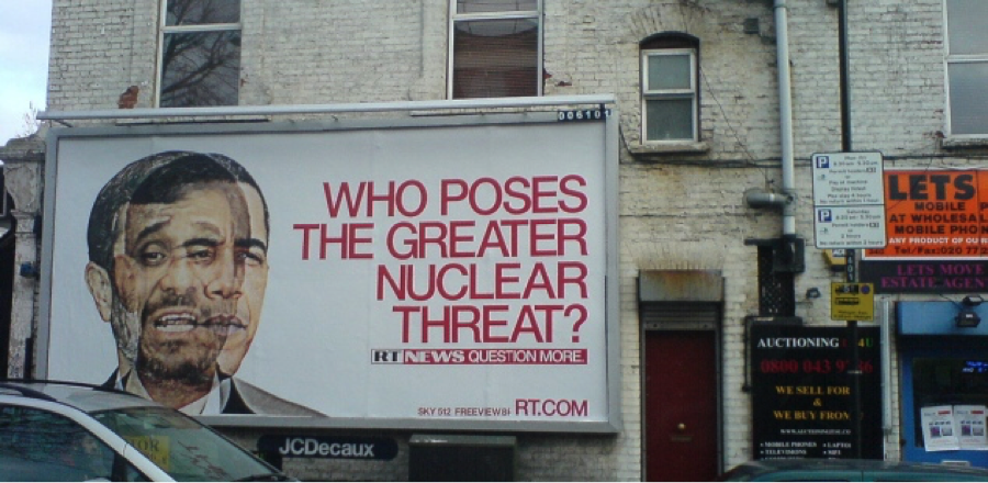
Although there are some exceptions, motorists are the main audience for outdoor advertisements. We can assume that most of these motorists are traveling at high rates of speed. With that in mind, as mentioned before, six seconds is about all the time you have for your billboard to be seen. And, actually, this timeframe has diminished with today’s plethora of in-car distractions. Between the coffee-sipping, texting, tweeting, email-checking, Snapchatting and Spotify song-searching, drivers barely have enough time to look at the road, let alone your billboard.
So your ad needs to grab their attention. And then let it go soon after. Catch and release. There’s that fishing metaphor again. Make it interesting, but not overly distracting. Be clever without being complex.
Do things like this: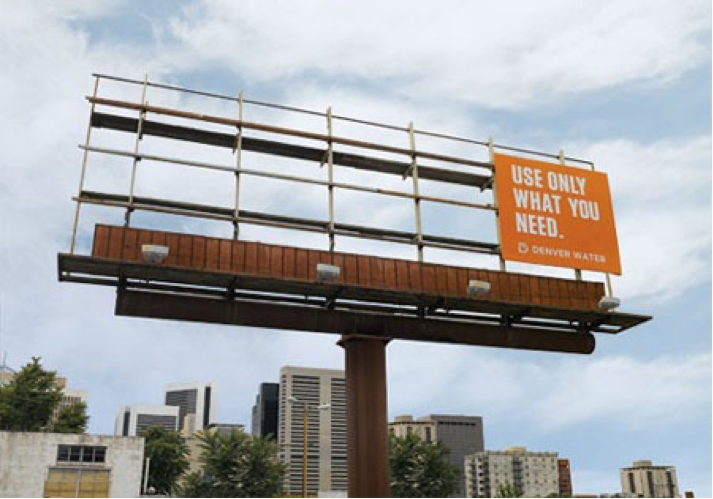
- CTAs don’t have to be actual calls
There are some exceptions though…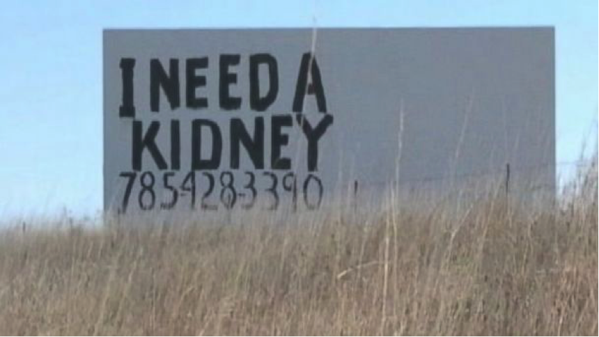
Billboards should be used for brand building, or to support a campaign. They’re not direct response advertisements. Do you really expect someone to see your 10-digit phone number and then dial right away? And if not dial, remember it? And if not remember it, write it down for later? No one carries pens anymore.
Lose the 10-digit phone numbers (unless you need a kidney).
If it makes sense, put a location on there. Perhaps an intersection, or a “Take your next exit.”
Avoid things like this: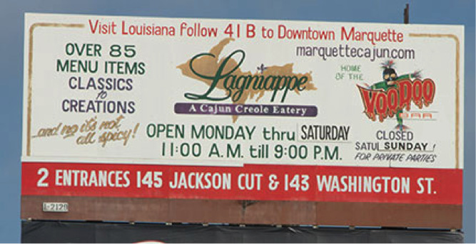
A good CTA is a web URL. They’re easy to read. And they have the most recall. - Lastly, location, location, location
If possible, check out what’s currently filling the space where your ad will be placed, or what’s next to the space. You can create great advertisements when you don’t know what’s around, but you can create even better ones when you do.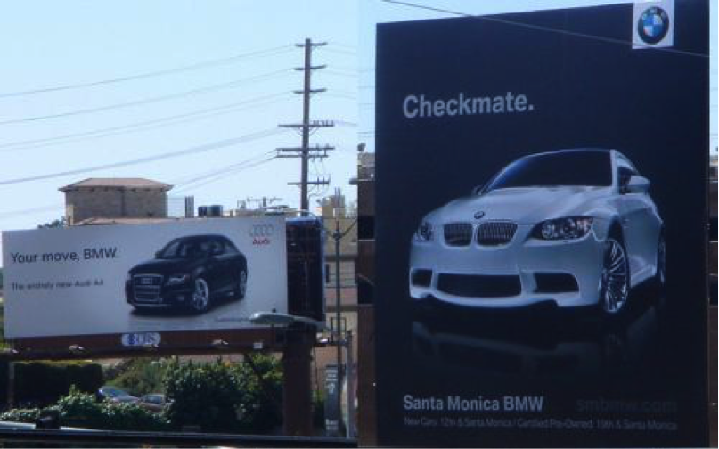
Also, knowing the location of your ad can help you avoid some… awkward situations.