Matching Your Website's Digital Design with Functionality
Web design has drastically changed over the past two decades. It is ever-evolving with new options for functionality to choose from. With hundreds of options available it is easy to get carried away with all the new and cool toys out there in digital design.
Digital design is extremely important, because the design is the first impression and voice of your company. With this being said, each company is different and should have a design that is specific to accomplishing their goals. There is not a perfect “template” for a good website, even though all of the new site-builders lead you to think otherwise (Squarespace, Wix,...). What might work for one business is not always the best fit for another. For example, ToysRUs would have a fun, playful look, whereas BrickHouse Security would need to be serious and informative.
Every action in digital design has a reaction that affects the site. Here are a few pointers to keep in mind when creating the best website for your company.
- Load time. Every time an item moves, slides, or enlarges, it affects the size of your site. It doesn’t matter how cool your website might be if it won’t load for potential customers. They are going to click off of your site before they even see that awkward kangaroo bounce across their screen.
- Responsive (mobile-friendly). Just because your site looks great on a desktop, doesn’t mean that it will look good when viewed on a mobile device. In 2014, 46% of adults, 16 or older, used a laptop or desktop for internet access. That leaves a huge audience to consider who is also viewing your site.
- Overload. The last thing that you would want is to leave your audience feeling stressed and overwhelmed after visiting your site. Guaranteed they will not be back.
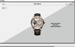
To help understand these tips, here are two designs to compare. Both websites use motion and newer techniques to engage the viewer. The Hour, uses their theme (time) to tie into every page. Even though the grey and white space are simple shapes that serve as a clock, it is overwhelming and doesn’t actually inform the viewer.
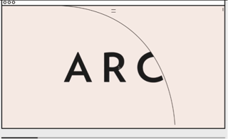
ARC also uses motion as you scroll down their page. You control of the speed as you scroll, and this allows for a calmer atmosphere. This site uses a simple shape to enforce their theme just like The Hour, but the difference is that it isn’t always moving, and it serves a purpose to guide you toward the other content.
As digital design evolves, remember the purpose of your website. Remember that you don’t want to only rely on special effects to share your message.
Remember form before functionality.


