Twitter's Big Update Changes Platform Look and Feel
If you've updated your Twitter App recently you might have noticed a few changes:
- You no longer see photo links "pic.twtitter.com/39487848927" in the tweets uploaded via Twitter Native (Twitter.com / Twitter app)
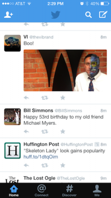
- You see the symbols for "Reply" "Retweet" and "Favorite" embedded into each tweet for easier use
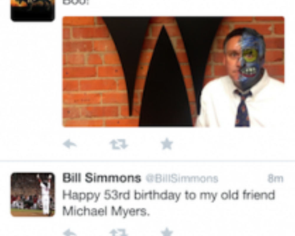
- You see some photos (those uploaded via Twitter Native) without clicking on the tweet
Number 1. doesn't seem to be that big of a deal (except that it makes the app appear cleaner, but number 2 and 3 could be potential game changers for those who are tweetaholics and run business accounts.
Because there is no longer a need to click on the tweet to open a new frame to "Reply" "Retweet" and "Favorite" tweets, you will begin to see analytics skyrocket for most users as those features now take half as long to do. Now, "half as long" might equate to about .3 seconds, but still, to most people that .3-second save is a big barrier when you can scroll through about 6 more tweets in that time.
The change in giving Twitter-uploaded photos an upfront visual space without the need to click-through is where this update falls into that "breaking new ground" category, and I'm sure made those "at the top" at Twitter scratched their heads and said, "Are we really going to rip-off ideas from Facebook?"
In the last 5 years Facebook has been far from shy when it comes to ripping off Twitter. Facebook implemented the newsfeed because of Twitter. Facebook implemented the Hashtag because of Twitter. Facebook began allowing the "@" tag because of Twitter. Am I missing anything else? It seems now though, that Twitter is taking a page right out of Facebook's playbook: Visibility and Space.
If you're a Hootsuite user, sorry 'bout ya, but you just became kinda outdated.
Uploading a photo via Hootsuite or any other 3rd-party applications has always displayed that photo in the form of a link (which was no different than uploading that photo via Twitter app), but that has now changed. Uploading a photo using Hootsuite now and you'll notice that the phenomenal photo you took of your cute 2-yr old pulling on the dog's tail appears as a link (as always). Upload that same photo using Twitter.com or the Twitter app and that precious photo will show up front and center - no link - just out in the open...taking up as much space as 2-3 normal tweets.
 Old Twitter Update
 New Twitter App
This move to show the photo LARGE in people's tweetstream/newsfeed is what Facebook has been doing for years now. It's no secret that if you upload a photo on Facebook it will receive more "column inches" than those who upload just text. it shows up larger, gains more attention and (case-by-case) will receive a higher engagement rate, thus improving your Facebook EdgeRank.
So, now we see Twitter making the move to look more like Facebook. It still looks good though, right? Yes, for now.
I imagine those photos will begin to be flooded by advertisers getting their images in your face. Get ready. Twitter just filed its IPO to be a publicly traded company (a la Facebook) recently and I see this as just the 1st to many more changes to come.
Is it time to ditch Hootsuite / 3rd-party apps? Probably not completely as they offer other some great features:
- Scheduling out a tweet
- Multiple streams at once
- Keyword searching
- Multiple logins
- and more
However, if you've got a photo to upload it might be time to head back over to Twitter.com to upload it, and expect these listed items to come to Native soon - can't have unhappy shareholders.


