If you are one of the 850 million users on Facebook, your experience on the social site is about to drastically change - beginning today.
If you have a personal page, you’ve had the chance to tryout Facebook’s “Timeline" for a few months now (with research showing that most of you hate the Timeline) and not until today did Facebook make that option available for its Pages.
There are many reasons that Facebook decided to roll this out. One reason is that Facebook had left businesses in the dark for an upgrade for over a year, allowing personal pages to shine on much more interactive and visual. It made businesses want to start a personal page and just call it a business page but do to restrictions and guidelines, Facebook could without warning, shut down your page completely.
So, with the new changes, I feel that now businesses are “on top" as far as having more visual and “cool" functions. This doesn’t surprise me considering Facebook is filing to be publicly traded this year…time to raise the revenue stream…thus, making advertisers want to be more involved.
Changes:
1. First thing you’ll notice when visiting your favorite Brands (http://www.facebook.com/thevibrand) is the 850px x 315px space available for JPEG upload (see above photo). This space will open up the page to a much more visual appearance than the 180 x 540 space allowed on the old site.
There are a few rules to this new photo space. These photos may not feature Price or Purchase information (45% off!), Contact info, the photo may not have text that instructs the viewer to take action on Facebook (comment, share, like, etc.). The brand also may not instruct the viewer to use the brands Timeline photo on the users Timeline.
2. Another big change a viewer will notice on a brand’s page is the absence of tabs that were previously all listed down the right side of the page in “list" form. On the updated platform, these tabs (apps) are now in “icon" form only showing 4 apps with a clickable button to show other apps. This way of displaying the apps/tabs must be changed in some way. Viewers are not going to click a button to see what other apps on the brand’s page. It’s just not going to happen. Facebook needs to find a way to display all apps at one glance.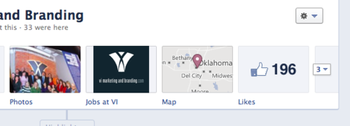
The only upside to the new icon feature is that it adds a more visual appeal with larger customized logos/photos to insert as the icon instead of plain text and very tiny icon.
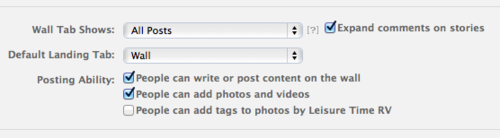
3. A feature that businesses took advantage of was the “default landing page" that was offered on the previous platform design. No more of that. Everyone lands on your timeline now.
Old look:
New look:
4. There is also a new “admin" feature at the top of the page that displays the page’s insights in much easier to view way. No more clicking a bunch of tabs and scrolling down to see a certain thing, it’s mostly laid out in front of you.
5. There was a big disconnect between the private messaging of consumers and brands, primarily because there was no private communication allowed between consumers and brands. Now, Facebook displays a “message" button on the brand’s page for consumers to contact the brand via a private message where the brand can respond privately. This will help out considerably for those customers who are upset and need to get in touch with someone (keep in mind, brands can not start a private message, it must be instigated by the “fan" of the page. Smart on Facebook as opening up brands to directly contact consumers would lead to loads of spam).
6. Apps are now allowed to take up more space horizontally. This will come in handy when placing a website/webpage into an iframe or developing an app that doesn’t have to fit into a small 520px wide space. The new space will be a centered 810px wide. Plenty of room to work with.
Downside to the wider space? All the apps that were formatted to the smaller space now have to back and change their settings, in most cases meaning an entirely new app development.
7. Instead of one “easy to decipher" column for your news feed, all timelines have a confusing two-column set, which seem to randomly configure the right column with updates that aren’t necessarily recent. the column on the left will always host the most recent update but beyond that…who knows for sure. The right column does seem to show content in which in somehow links you and the brand’s page (showing you the people that “like" this page with you and some past interaction you’ve had with that brand).
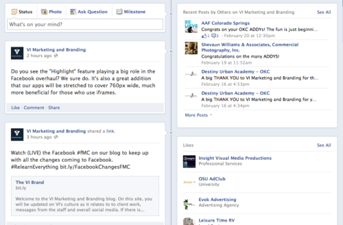
A couple upsides to the two-column feature: there is an option to make a post a “Highlighted" item which will enlarge the post to cover both columns and making it stand-out over other posts. Perfect for a new commercial launch that you don’t want to get lost in your feed or a post announcing the biggest sale of the year. It will be interesting to see if brands over use this feature and make nearly every post highlighted to enlarge its presence on the page.
Highlighted:
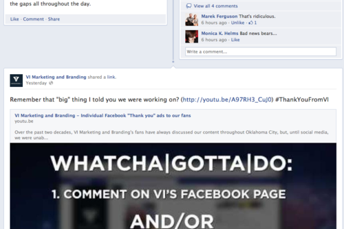
Another positive addition to the Timeline is that you can “pin" an update. When a post is “pinned" it will place an orage tag in the corner of the update and place the update at the top of your feed permanently, until you remove its “pin" status. This would be good in days where the brand will have an event, and want to use the “pin" as a makeshift “headline" for the day/week.
What else is new on the page? Let me know in the comments.
One thing not mentioned in this blog is the enormous takeover that you will see in ads. That blog will come later (Premium Facebook Ads).