The 5 Principles of Great Flag Design - Oklahoma City, Are You Listening?
Oklahoma City has a problem, and it needs our help. I’ll get to that problem in a short moment...
Our city has been riding a renaissance of development and renewal for the past several years, creating beautiful spaces and investing in ourselves to make the place we call home more livable and more attractive. Exciting even!
Yeah that’s right, people want to live here now instead of running for the coasts or anywhere but here. Flyover city we are no more! So with all this rush of civic pride, we should be out waving our city flag that represents us all everywhere we go, right
Wait… what city flag? Oklahoma City has a flag?
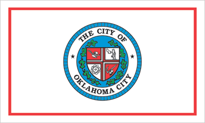
Is that the question you’re asking yourself? Before you go googling away I’ll save you the trouble. Here it is.

Likely this is the first time you’ve seen it, and there’s a reason for that.
It’s a bad flag. An SOB (seal on a bedsheet) if you will. And nobody cares about it.
And that’s the problem I’m getting at.
Oklahoma City’s flag finished 130th out of 150 city flags in an Internet poll sponsored by the North American Vexillological Association. That’s a stark contrast to how we consistently rank in other nationwide surveys. OKC is at or near the top in dozens of other lists – in categories such as America’s friendliest cities, best places to start a business and even best burgers in America. Have you had a Nic’s burger?
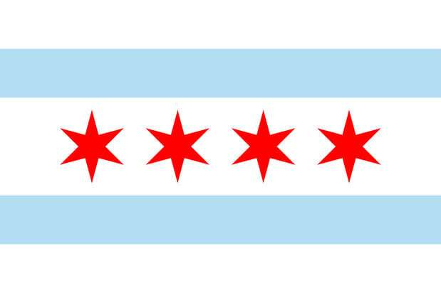
In an entertaining and eye-opening TED talk by Roman Mars, host and creator of the podcast 99% invisible, we are able to see what other great cities like Chicago and Amsterdam have done right when it comes to flag design.
Here’s what they look like.
City of Chicago Flag:
 City of Amsterdam Flag:

These flags follow the 5 basic principles of good flag design as stated by the North American Vexillological Association, also known as the people who know what the hell they’re talking about in terms of flag design.
These principles are:
- Keep it Simple
- The flag should be so simple that a child can draw it from memory - Use Meaningful Symbolism
- Use 2-3 Basic Colors
- No Lettering or Seals
- Never use writing of any kind, because you can’t read that at a distance - Be Distinctive (or be related)
The interesting part about this list is a designer of any discipline can tell you these principles apply to all types of design. And because these flags follow these rules and practice good design, the citizens of these cities have embraced them whole-heartedly.
So what do we do about our SOB flag? Well, it’s pretty simple. We change it!
So what are the hurdles? Buy-in mainly. More specifically, buy-in by city leadership, the ones who can get the ball rolling in a serious way. Some will undoubtedly say, “Don’t we have more important things to worry about? What about our education and our state budget crisis? What our city flag looks like isn’t important.” And to that, flag expert Ted Kaye has this to say. “If you had a great city flag, you would have a banner for people to rally under to face those more important things.”
Major cities like San Francisco down to small towns like Pocatello, Idaho have taken steps to rethink their poorly designed flags, and there have been some initial efforts started on the part of students and other independent groups here in Oklahoma City.
Here’s how I see it. We’ve spent all this effort with MAPS and other projects beautifying and improving our city for the benefit of our citizens and visitors. We should have a flag that champions that image. One that reflects that sense of pride and value we possess. One that won’t cost millions of dollars like those projects and could actually generate revenue through sales of flags and flag emblazoned merchandise.
In a polarizing time where events around the country seem to be driving us more and more apart, a beautiful, meaningful flag is something that can bring us all together. All great cities deserve a great flag, and we, my friends, sure have a great city on our hands.
(To learn more about VI's Design Services, click here)


