The Complete 8-Step Logo Design Process
The fact is people care very much about logos. If you’ve ever read the dialogue around a major company’s rebrand, you’ll quickly realize this. Here’s an example of the firestorm that has been Tennessee’s state government rebrand. And don’t get me started on the rumors of the rumors of the Thunder logo being redone. We all know that was a misstep (it’s ok, I bought the t-shirts too). And contrary to what those comment sections say their 5 year-old probably won’t be able to make a logo that will work for you. The point is, logos are important to people and businesses. They are tasked with the job of representing a company, team, community or initiative in a simple yet unique form. That isn’t an easy nut to crack.
With that in mind, we need to expose the basic design process that most professionals use to create effective logos and branding in an increasingly saturated world of imagery. Here are some basic principles or guidelines that by following will hopefully guide you towards the logo promise land.
- Information Gathering/Research:
Learn everything you can about your client. Your job is to get them to tell you who they are, what they do, why they do what they do and how they’re different. Ask questions that will elicit descriptive yet concise answers that can be helpful and informative for crafting a logo. Find out where and how their logo is primarily going to be used. And you soak all that up, and then you go off and do a bunch of your own research, both informational and visual. Next level image search. Wikipedia. Encyclopedia. Look at all the pedias. Google till you can’t goggle at your screen anymore. The point is, do your due diligence here. Information and research are the building blocks to making informed design decisions.
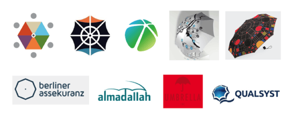
Here are some visual references I pulled while doing research for an Umbrella Share Program called Pop-Ins that we designed for the Downtown Business District:
- Sketching:
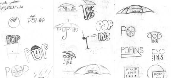
Once you’ve waded into the pool of information and research and are all nice and pruney, it’s time to get out and put pen to paper. DON’T YOU DARE JUMP STRAIGHT TO THE COMPUTER! Sketching is where information meets experimentation. The mind is able to operate more unobstructed and imaginatively when you don’t have tools telling you how to make things. The name of the game here is to sketch loosely and generate a volume of ideas. Don’t spend an exorbitant amount of time doodling, but put in some time to give the best solutions the chance to manifest themselves.
Here are some sketches from the Pop-Ins project: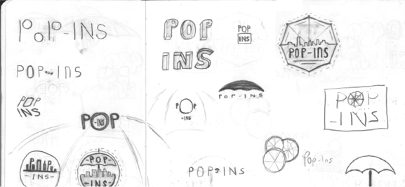
- Draft Designs
After you’ve selected a few front-runners you may decide to sketch those in more detail, or you may jump to the computer. It’s really up to the designer and whether they have a good handle on the direction and form. Sometimes the execution of an idea comes together quickly. And sometimes you have to spend hours massaging it to get it right. Refine, tweak. Refine, tweak. Does this bee look more like a butterfly? Does this typeface make my logo look fat? This is where attention to detail matters. The clever or subtle nuances are often what can separate a good logo from a great logo. Here’s a great example of subtle nuances used to refresh Mail Chimp’s logo.
Another good practice for logo design process is to start in black and white. Your logo’s success or failure shouldn’t be dependent on that pop of orange you added or that soothing blue you chose. The structure of the mark or logotype alone should be able to communicate the concept and be legible without the crutch of color; otherwise it’s not a successful logo. Additionally, color is subjective. It may work for the design, but the client may hate that shade of periwinkle you chose for their flower shop logo. By the way, that’s something you can avoid through step 1 of the process.
This image shows some experimentation with shapes for an over the top view of an umbrella:
- Internal Review:
Once you’ve generated your best concepts, it’s time to let the critique darts fly. Only the designs you feel strongly about should go in front of a client. Getting outside opinion, especially from your peers will help expose weak points and discover opportunities you may have become blind to from staring at it too long. The power of many minds is always greater than one.
Here are different iterations of a single concept that shows the crafting process that led to the final presented solution (seen further down in the blog). We wanted to incorporate some sort of visual that directly tied to the OKC downtown business district, but we decided it was too much to ask of the logo to incorporate the skyline graphic into it. Therefore, we focused on simplicity, easy recognition and legibility for the logo and let the skyline graphic be displayed on certain applications as a complimentary graphic to the logo instead:
- Rationale:
Once you’ve arrived at your final solutions, you should create a relatively short synopsis for each to explain how you arrived at your solution, what the logo is intended to communicate and the details that help it to do just that. This gives your client insight on how and why you did what you did, and gives them something to take away with them should they need to take some time to make a decision. - Presentation:
Again, you must really commit to the strongest designs here. Showing a volume of designs isn’t fruitful when you should only be showing a few. This number of options flexes from project to project, but the principle stays the same. Only present designs you’re proud of and that your client can be proud of. This should help with the temptation for the client to suggest Frankenstein design, which is attempting to take elements from altogether different solutions and mash them together into an unwieldy beast of a logo. It also helps to show black and white versions first to avoid knee jerk reactions to color and wind up putting the kibosh on that beautiful mark you made because they didn’t like the color you chose.
You may need/want to show some context for a mark. Sometimes it’s hard for somebody to make a decision based on a logo sitting by itself on a white background. You may want to throw the logo on a business card or a t-shirt (or whatever application is appropriate) to show how it lives beyond that white piece of paper. If you have the budget and time for this it can be helpful, but it’s really something to consider on a case-by-case basis. This also may be something you can explore after the presentation as well if you’ve narrowed to a couple and the client wants to take it a step further before making their decisions.
Here are the five solutions that were presented. These five were shown to display a good variety of styles, and they were shown strictly in black and white based on the knowledge that we would be limited to using black umbrellas and one color for screen-printing. Each solution carries characteristics that speak to the friendly yet metropolitan concept of the project and its name: 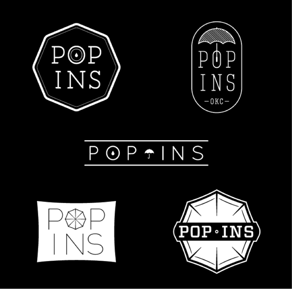
- Revisions:
You may hit a home run on your first go and the client doesn’t want to change a thing, but more often than not you’ll be asked to make some revisions. Your goal is that you’ve done the work up front that you’re only asked to make minor ones at this point and only to one or two designs. Can we make the dot on that I a circle not a square? Maybe that shade of red was just a little too hot for the client’s comfort. That’s fine. You’re in the home stretch now.
Here’s the selected logo with some small revisions based on feedback: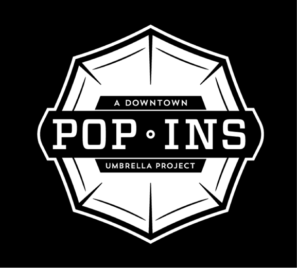
- Execution/Delivery:
Here’s where your selected design gets to spread its wings. Implementing your logo and developing the overall brand look on collateral, website, vehicle graphics, etc. Then you build out all the necessary file formats your client may need to conquer the world with their ravishing new look and give them guidelines to keep them on track.
Here are some examples of the end product: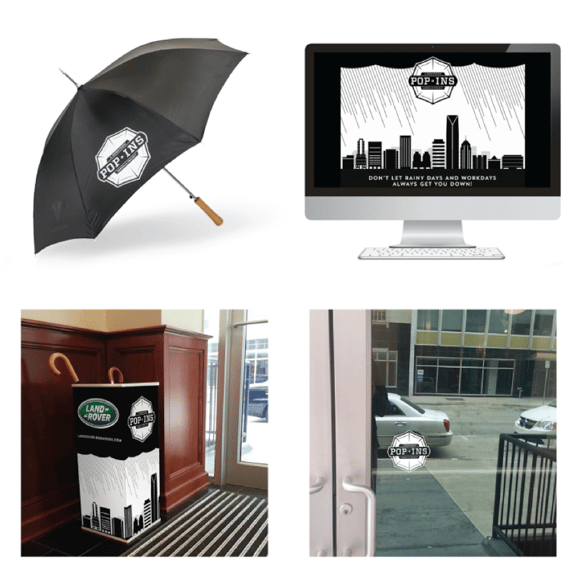
These steps are not law. Every agency, firm or freelancer will have their own spin on the logo design process, and rightfully so. It would be remiss to try to solve different problems the same exact way every time. It’s really all about taking the necessary steps to achieve the greatest output. Should you find yourself charged with task of designing a logo, this is a good place to start.


