Four Email Design Trends That Will Engage Your Readers Instead of Putting Them to Sleep
For the record, I HATE EMAILS. Email campaigns are even worse. They’re boring. Stuck in the past. Nothing has really changed. They use old technology. They play by old rules.
So how can we make email campaigns more engaging? Here are a few trends to make your emails more exciting.
- Design for mobile
46% say if newsletters are too poorly designed to be read on a smartphone it reduces the chance they buy something from the vendor, according to HubSpot. So what can you do?
- Utilize responsive technology – and don’t overcomplicate the design. Simple design ensures it will work across multiple devices.
- Don’t forget about CTA buttons (and make sure they’re easy to click from a mobile device).
- Experiment with video and animated GIFs
- Did you know Apple Mail and Outlook 2011 (Mac) both support HTML 5 video backgrounds? And, as long as you have a fallback image, other email clients won’t see a disruption.
- Animated GIFs allow for more interactivity. They provide an extra bit of interest and movement that piques the interest of your audience.
3. Utilize larger photos
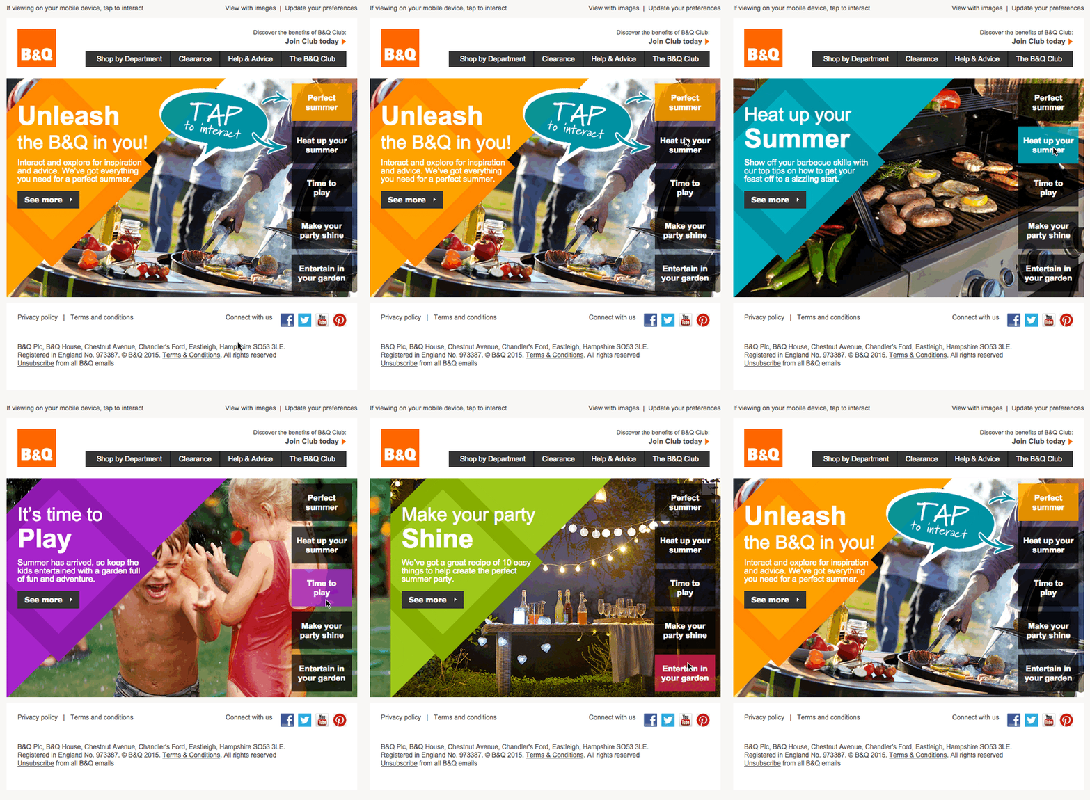
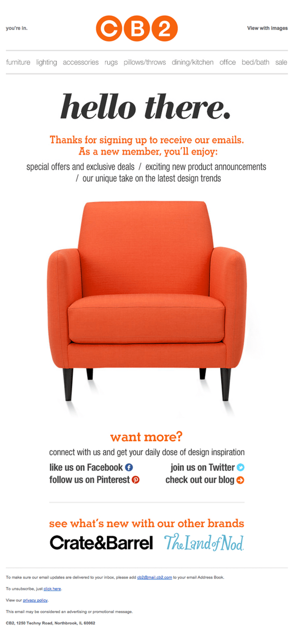
- Along with simplifying design, larger photos provide context for your products.

4. Explore Web Fonts
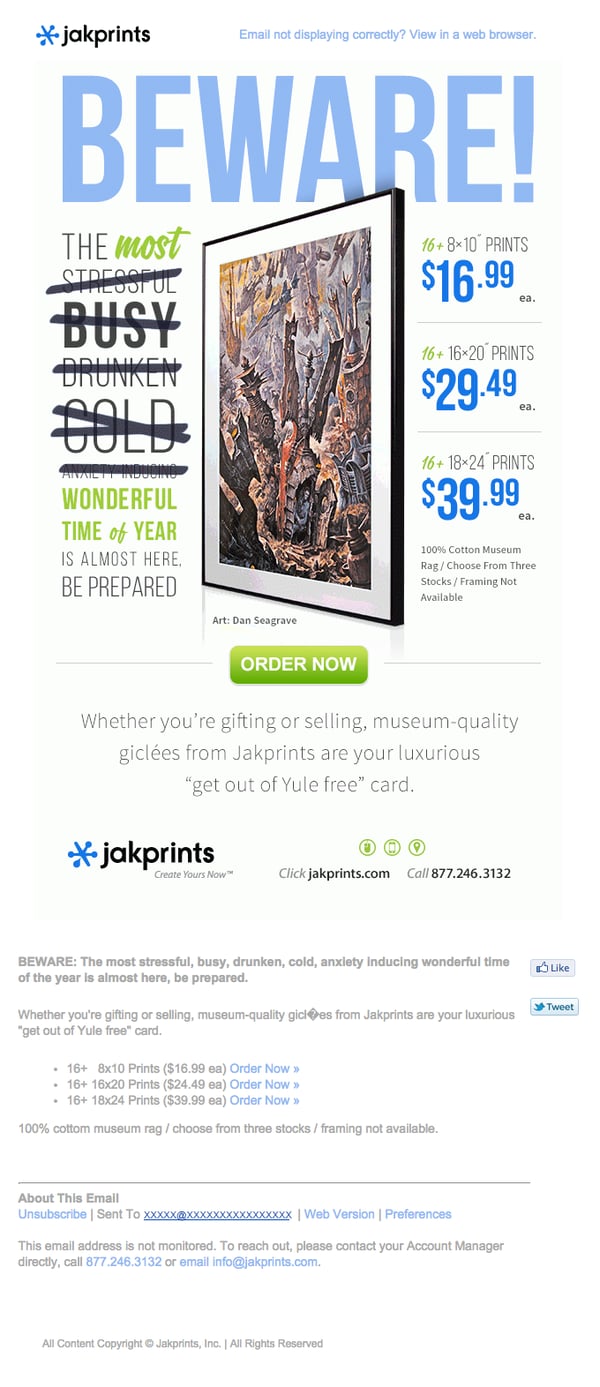
Finally, we’re no longer tied to Arial and Times New Roman.
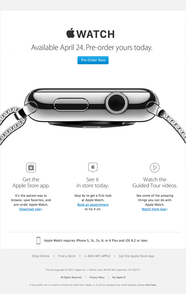
- Normal fonts have to be installed on a user’s computer to be seen. Web fonts, which have been around for several years, allow users to see fonts that aren’t installed on their machine because they’re included in the CSS. So what’s the big deal if they’ve been around for a while? They’re just now being widely accepted for email usage.
We all get hundreds on emails each day. Give your email a chance to push the boundaries and let us know what kind of results you get.


