At its foundation, every visual branding system is an expression. It can represent the story, the industry or the values of a company. As a designer, my goal is to develop a well-crafted logo (in the business, we call it a "mark") alongside a complimentary branding system. I work to achieve this goal with each branding project. And with each one, I develop new distinctive marks with adaptable branding systems at their center.
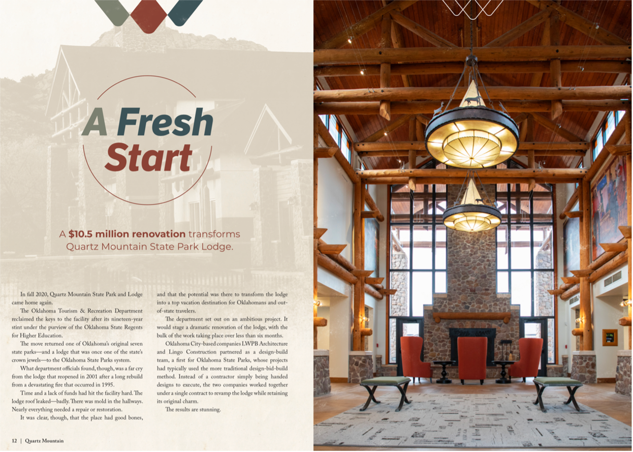
I recently found success in developing the visual brand for Quartz Mountain Lodge, a luxurious resort cradled in the stunning landscape of Quartz Mountain State Park in southwest Oklahoma. The lodge traces its history to the very creation of the park. So it's no surprise that the lodge and its brand have had many faces over the years. In 2020, park ownership returned to the Oklahoma Tourism and Recreation Department, along with a multimillion-dollar remodel. It was prime time to update the brand yet again.
Now before getting into the nitty gritty of the rebrand, it’s important to touch on some of the broader strategies I use to develop a visual branding system.
- In any creative process, there are endless avenues for developing an effective mark. A client's values can inspire color palettes and potential art styles.
- Sometimes the client's industry can provide a visual spark. Many marks feature tools of the trade or imagery tied directly to the brand's industry. This is a great starting point, but it's important to reimagine these symbols using colors and visual stylings that reinforce the organization's core characteristics.
- The letters of a brand name make an excellent canvas for representing its values and competitive edge. The first letter of a brand's name is a tried-and-true stage for the icons and visual styles that form the total visual package.
While designing the key components for the Quartz Mountain Lodge logo, I utilized all of these strategies to craft a mark layered with Quartz Mountain influences.
From the beginning of the process, there were a list of characteristic that provided inspiration. The lodge boasts an unmatched landscape of sprawling mountain peaks and waterways that set it apart as a distinct Oklahoma destination. Its architecture and distinct interior design are utterly unique — and played a key role in the style of the final mark.
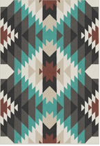
During the initial construction of the mark, I focused on the breathtaking mountain peaks that distinguish it from other Oklahoma destinations. But I also identified another tantalizing element. The lodge is decked out in a variety intriguing art styles, including Native American murals, native-inspired patterns and angular stained-glass windows and lamps. The remodel also included mid-century modern design, a style that also includes simple intersecting angular patterns.
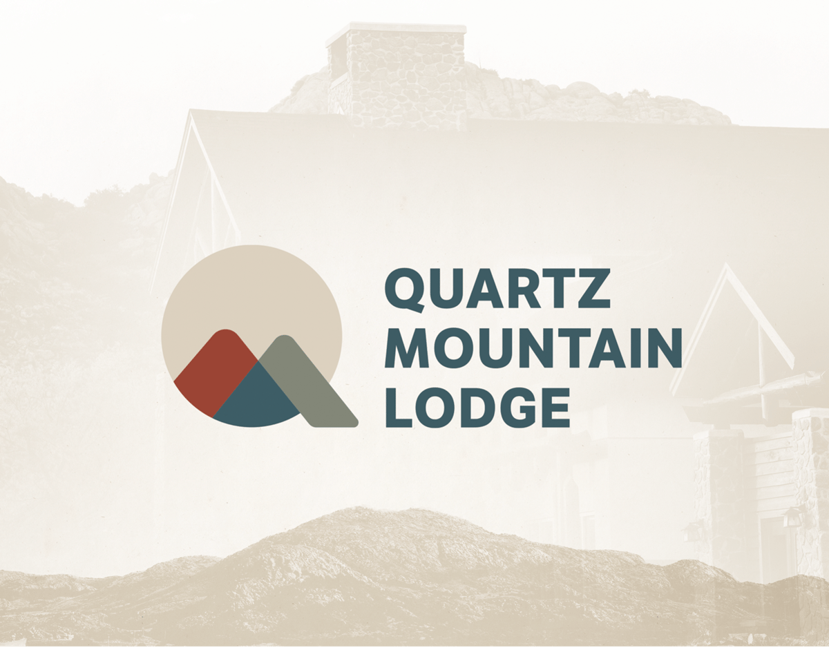
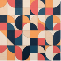
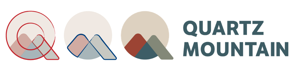
With this in mind, I started simply with two intersecting mountain peaks. I used their crossed lines and negative space to create an angular mesh of diamond shapes similar to native American and mid-century modern patterns. To complete the style, I separated the pattern into cooled earth tones: blues, greens, beiges and an earthy red. The red echoed the dramatic color changes the Quartz Mountains undergo at sunrise and sunset when they glow a shade of reddish pink.
Now at this stage I had both an appropriate icon, the mountain peaks, and a visual aesthetic incorporating artistic elements of the lodge. The most important step was pulling it together as a coherent visual whole. Conveniently, the Quartz Mountain name uses an accommodating main letter — “Q”. Its circular shape was a perfect container to cradle the mountain pattern within. The angular shapes of the mountains extended to form a leg for the circle, successfully creating a “Q” shape from all of the corresponding elements. The intersecting mountains finished off the mark by creating an “M”, referencing both the “Q” and “M” in Quartz Mountain.
This melding of elements is key to creating a mark that blends aesthetically pleasing visuals with the industry, values and competitive advantages of a brand. Every piece of the mark serves a purpose, and some pieces serve double duty.
One of those key pieces, the angular mountain pattern, is central to the branding system that is extrapolated from the logo. This lone element was essential to the project that soon followed the completion of the logo, the promotion of the newly renovated lodge in Oklahoma Today Magazine.
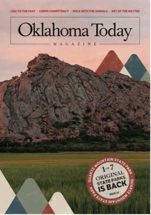
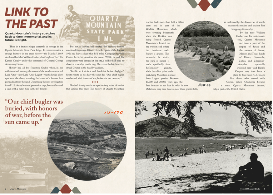
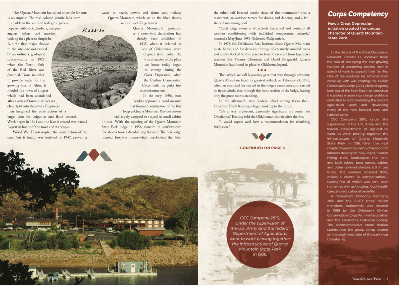
The promotion was featured in a miniature issue of the magazine that included front/back cover, and 18 pages of Quartz Mountain related content. The issue traces the long history of both the state park itself and the lodge, from conception to its current iteration. Every page was meticulously curated to embody the newly christened brand and highlight the extensive branding system just beneath the logo's surface.
At the end of the day, the Quartz Mountain Lodge got a distinctive visual identity that reflects its unique character, artistic flair and the primeval landscape that surrounds it. It's modern, yet timeless — an authentic representation of the brand, the experience and the lodge itself. And that's everything you can ask for in a visual branding system.