Regulating PDFunkiness
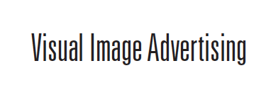
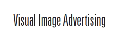
You'll notice in the image below that we are zooming in on the words 'Visual Image Advertising' and there are the noticeably bolder letters 'l' and 'i' in the words. As we zoom in, that disparity disappears quicker than my stapler. (Seriously guys, I want it back.)
For the past five years I've been explaining to our AE's that this is just an acrobat issue, and there is no way for me to export the file any differently that can make that annoying bold l's & i's go away. You can imagine my excitement when I discovered a setting that can just make that stop. I felt like Marco Polo. Vasco da Gama. Columbus, even! I had discovered a new world. A world without enhanced thin lines.
In your top bar, go: Acrobat (or Reader) > Preferences > Page Display > Click 'Enhance thin lines' to turn it off > BAM! Sanity restored!!!

Notice the difference!

From here on out, typography and design elements should appear as the designer intended them to. Novel idea, right?


