10 Signs It’s Time for a New Website
- User experience, design and data tracking are a few main factors in today's 2017 fast-paced marketing world, and knowing it's time for an overhaul can be a difficult thought to grasp. Does your business need to hit the update button with your domain? Possibly, but these 10 signs are good indicators you need to be thinking about your next steps.
You don’t have a responsive website.
For most of our clients, well over 50% of their website traffic comes from mobile devices, and the trend continues to grow. Screen sizes are becoming more and more fragmented as we continue to get more and more smartphones hitting the market. That’s why it’s important for your website to look good on any screen-size.You don’t have a CMS.
A long time ago, we built websites and allowed them to sit there for years before we needed to edit any content. That was in the time when not everyone had a website. Many of the sites consisted of content that was barely changed, your contact information, what services you offered and maybe a bio on the company owner. We’ve moved into an age where websites are much larger and our services change as technology expands. You must be able to update content on your websites, including your blog.Load time.
Websites' load times are becoming increasingly important to users. Users have a new expectation that your website loads within a matter of 2-4 seconds. With the advent of Facebook Instant Articles and Google AMP, users’ expectations are only getting more extreme. That’s why new sites should aim for no more than 2 seconds. You can test your website speed at tools.pingdom.com.Your site has Flash elements.
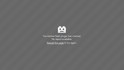
In April 2010, Steve Jobs declared that Adobe Flash was dead. He did everything he could to ensure that would happen. So, if your website still has a Flash feature or animations, then you’re well overdue for a new website. Let this screen be a reminder:You have a MIDI music playing in the background.
Back in the early 2000’s it was not rare to arrive at a hastily designed website and the developer thought, this website seems to be missing something. How about I spice it up with the a MIDI version of the Star Wars theme song… I might have been guilty of this. Sorry!However, I might be wrong on this prediction. So, if you’d like to continue reading this blog posts with an 8-bit MIDI version of the Star Wars theme, go ahead and click the play button below and continue reading.
Can’t find it on Google.
As you can already tell, users’ expectations have shifted so much in the last few years. Google’s algorithm is centered around providing excellent results to searchers. That is exactly why people continue to come back to Google and use it over and over. So, if you’re website is unintuitive, non-responsive and doesn’t load quickly, it is very likely that Google doesn’t want to send users to your website. It’s of critical importance that visitors can find you on Google. As the old joke goes:
Q: Where is the best place to bury a dead body? A: On the second page of Google’s search results. (Learn more about VI's SEO service offering.)
Your design has distracting animations.
There was terrible stretch of time on the web when developing a cool website was considered better than creating a great user experience. People would design websites with flashing text, moving elements and special mouse cursors. Fortunately, we’ve moved into a modern era of design that ensures a sophisticated website experience where less is more. Well, an example might be better to show you: http://www.angelfire.com/super/badwebs/
Users can’t find what the information they need.
There is nothing more frustrating to show up to a website and not be able to find the information you’re looking for, whether it be learning about a service offering or even a contact phone number. All website designs should start with thinking about your potential users and what they are seeking. Then, we design streamlined user paths to ensure that happens. At VI, we have a 3-click rule that requires users should be able to find what they’re looking for within just 3 clicks.
(Learn about our 5D process for Website Development to ensure that users can find the information they’re looking for on your website.)You don’t have an SSL certificate installed.
Your teenage nephew built it in 2001.
We hear this more than you would think, but a lot of people will ask us, "Why is a website so expensive? My nephew told me he would design our website for 500 bucks." Well at VI, we have a rich history of designing hundreds of websites. We are creative professionals dedicated to exploring modern, cutting-edge techniques to crafting the most unique website experiences. It’s a bit different than your 19-year old nephew taking a break from eating Cheetos and playing X-Box… I might know this from experience. Thank you Uncle Bob for one of my first paid gigs, website circa 2001.
Want to continue reading more blogs from VI’s digital department? Check out some of my favorites:


