Call to Action Examples to Use Throughout Your Marketing Strategy
A call to action (CTA) is crucial in pulling users down the funnel toward a conversion. CTAs often take the form of big, flashy buttons on campaign landing pages, urging users to submit a form or take advantage of an offer.
When it comes to less promotional content marketing efforts, CTAs can be easily overlooked. After all, many blog posts, infographics and videos serve to educate or entertain users, who then proceed to bounce right back off the page. When you conduct a Google search to find the name of that-one-actor-you’ve-definitely-seen-before-in-that-one-show and you end up on IMDb, you most likely aren’t going to click around IMDb for another 30 minutes. You visit the page that answers your question, then move on. This user behavior doesn’t mean content isn’t beneficial and effective, but when it occurs on your site, it may mean you have additional opportunities to consider.
If you’re like most brands, you likely spend somewhere around 29% of your marketing budget on content marketing efforts. And while it’s natural for some of that content to drive traffic with high bounce rates, it's worth evaluating your content and CTA strategies to ensure the two work hand-in-hand to accomplish your brand’s goals. After all, a few compelling, eye-catching CTAs can turn a bounce into a conversion. Here are a few tips to consider when planning CTAs for your content.

- Consider the stage of the funnel. If your piece of content is aimed at top-of-the-funnel brand awareness, your CTA may be more effective at providing additional education rather than encouraging a user to “buy now!” Put yourself in their shoes and consider the natural progression of the buyer journey. After consuming this piece of content, what’s the next question on the user’s mind? Continue to make the consumer’s needs and questions a priority and you’ll be sure to keep them interested.
- Consider the content type. There’s no one-size-fits-all when it comes to crafting an effective call to action. A CTA for a video will likely look different than one for a blog, infographic, slideshare, webinar, etc. Once again, consider how the user will consume the content and where additional questions may arise — these are perfect opportunities to provide a call to action. And above all, don’t set and forget. Continue to test different placement, copy, colors and forms of CTAs to find the perfect fit for optimal click-through rates.

- Consider using more than one CTA. While too many CTAs can be distracting and confusing, including different types of calls to action in one place allows users to click through for a next step where and when it's most convenient for them. It also allows you to provide CTAs tailored to unique consumer needs. However, all calls to action should work together to support one goal for your brand, for the piece of content and for your overall marketing strategy.
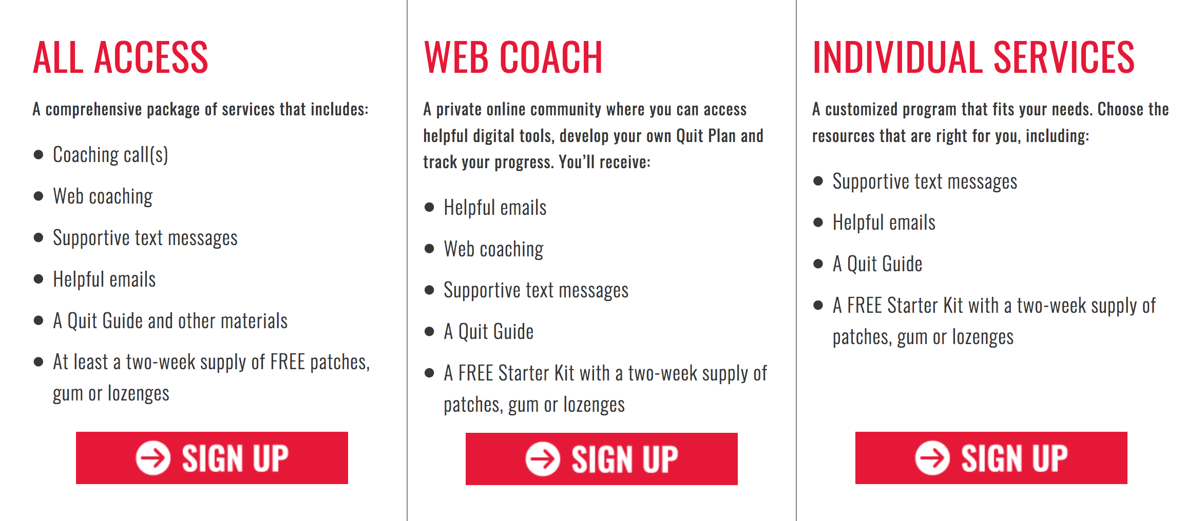
Graphic (below): Examples of CTAs from OKHelpline.com.
(To learn more about VI's marketing services, click here.)


