Hip To Be Square
I love to discover new, cool web tools, and see emerging technologies being used to craft really great user experiences. I get excited when I see things like the Arcade Fire and Google Experiment and think, “I wish I had built that!”.
There is a web platform called SQUARESPACE that I use periodically that is similar to WordPress, Drupal etc. I especially like SQUARESPACE for a number of technical reasons, but primarily because it is one of the most user friendly and easy to use platforms available. It also has great e-commerce tools built in that are quite good.
Recently, SQUARESPACE launched a new feature called SQUARESPACE Logo that lets you design a logo right in the browser, without needing to know any additional software. Pretty cool, huh? Now any scrappy upstart can whip up their very own mark for free in minutes, without needing to deal with the hassle and cost of a design agency.
Eh, no. Not really.
When I think about a really great logo and compare it to a poor one, it is evident to me that the chasm between the two is more than knowledge of graphical tools. Sure tools like SQUARESPACE Logo can provide you with a professional looking (albeit stylistically limited) logo, but it is unlikely that it should be YOUR logo. It lacks the critical objectives of a reputable design or branding agency, like addressing your audience, telling your story and representing your business today and in the future.
From a designer’s standpoint it’s a fun but laughable tool. For years designers have been parodying the inevitable replacement of critical brand building professionals with simplified and childish pre-formatted templates. Essentially distilling the years of experience and talent of a creative team into a game of mad-lib where your company is the punch line.
Some of my favorite satire includes the hipster logo design guide and the agency name generator.
Imagine your business is a patient that needs surgery and you, the business owner, are the surgeon. The only problem is you’ve never performed surgery before or even been to medical school. Nevertheless, you’re shoved into a room with a table full of sharp pointy tools with your brand, lying hopelessly in front of you, waiting for you to butcher it.
Some of these new, cool web things are just for fun, i don't recommend distractions like this for your business, instead focus on what you do, and let creative professionals do what they do.
A brand, a logo specifically, is so much more than an icon and a typeface. Take a look at some really great brands like amazon.com, GE and BMW, and you can see that their brands, like their logos are artfully crafted and refined.
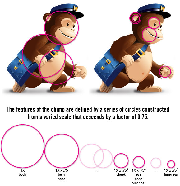
I’ll leave you with a quick study of one of my favorite brand’s logo, MailChimp. Their mark removes the complication of what they do (email marketing), and reassures users that they can manage their email campaigns on their own. But even this simple icon is highly refined and geometrically based on the “golden ratio”, which is one of those things that designers think are important. In this case I think it just works.
 *re-created with(out) permission from “Design for Hackers” by David Kadavy. Buy it on amazon.
The saying goes “Good, fast, cheap. You can pick two.” That’s true with cars, the opposite sex, and with your business’ brand.
What compromises are you going to make?


